FONT Rendering - Could Be Better
Moderators: PDF-XChange Support, Daniel - PDF-XChange, Chris - PDF-XChange, Sean - PDF-XChange, Paul - PDF-XChange, Vasyl - PDF-XChange, Ivan - Tracker Software, Stefan - PDF-XChange
-
walterh
- User
- Posts: 13
- Joined: Sun Jan 27, 2008 8:08 pm
FONT Rendering - Could Be Better
have the latest XCV 2.0.40.4 release (Wdoz XP, SP 2) .. seems printing now works as expected, and generally am quite satsfied (program overall could be a bit faster, but its certainly extremely usable)
however, i thought the font rendering was a bit 'fuzzy' and compared the same file, side by side, to Acrobat Reader 7.1 (AR) .. sure enough the fonts in AR were extremely / razor sharp, those in XCV were a bit fuzzy .. i tried adjusting the font gamma and other things, to no avail ..
obviously the software has made enormous advances in the last 6-9 months, and is terrific with no apparent major problems (now that the printing issue has been fixed), i would still greatly greatly appreciate improvements in font rendering and crispness over the coming months
-W
-
David.P

- User
- Posts: 1694
- Joined: Thu Feb 28, 2008 8:16 pm
Re: FONT Rendering - Could Be Better
Yeah this is absolutely true.
Unfortunately, PDF-XChange Viewer only uses normal antialiasing (pixel based) whereas Windows XP in general as well as Adobe Acrobat employ subpixel based font rendering which is why fonts look less fuzzy in Adobe Acrobat which has a very good font rendering implementation called Cooltype.
I strongly support your request (had requested the same already some months ago, but with no avail so far)...
Cheers David.P
David.P
PDF-XChange Pro
PDF-XChange Pro
-
Ivan - Tracker Software

- Site Admin
- Posts: 3602
- Joined: Thu Jul 08, 2004 10:36 pm
Re: FONT Rendering - Could Be Better
Not exact, David. PDF-XChange uses subpixes antialising for all drawings, including font. Trouble is because PDF-XChange for now draws text as curves, without font hintings.
We are working on fotns hinting engine and very hope than soon we will have much better font rendering engine.
We are working on fotns hinting engine and very hope than soon we will have much better font rendering engine.
PDF-XChange Co Ltd. (Project Director)
When attaching files to any message - please ensure they are archived and posted as a .ZIP, .RAR or .7z format - or they will not be posted - thanks.
When attaching files to any message - please ensure they are archived and posted as a .ZIP, .RAR or .7z format - or they will not be posted - thanks.
-
David.P

- User
- Posts: 1694
- Joined: Thu Feb 28, 2008 8:16 pm
Re: FONT Rendering - Could Be Better
Hi Ivan & Tracker Team,Ivan - Tracker Software wrote:PDF-XChange uses subpixes antialising for all drawings, including font.
sorry but I think this is not the case?
This is an enlarged screenshot of a drawing in Ad*be Acr*bat:
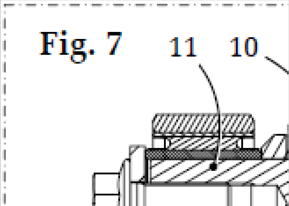
Since subpixel antialiasing always creates coloured banding (subpixels ARE colored either R, G or B, so there's no way around that), you can see that Acr*bat doesn't use subpixel antialiasing for the lines, however it does so for the fonts.
Below is the same screenshot from PDF-XChange Viewer:
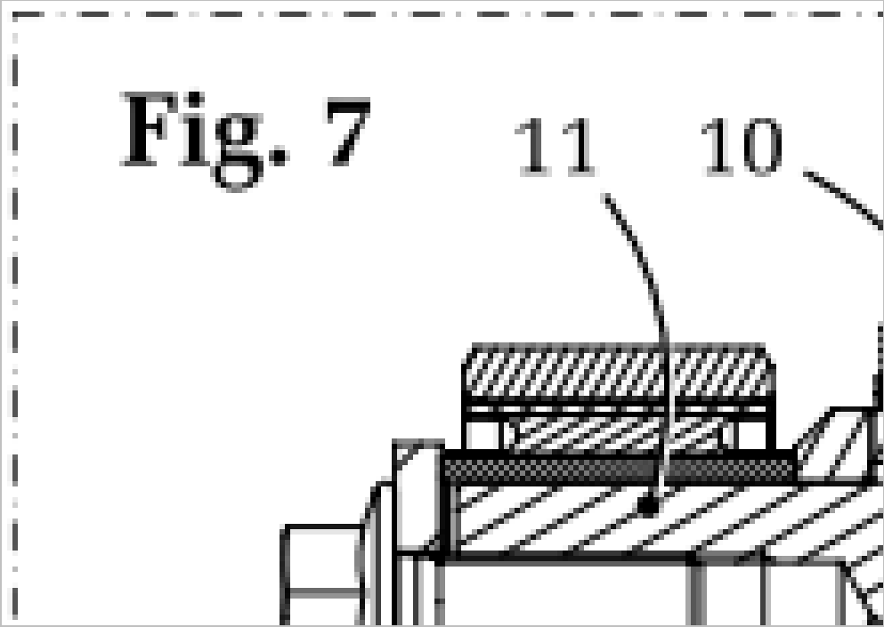
Here, neither the vector lines nor the fonts are subpixel antialiased since there is only greyish (meaning full pixel RGB) antialiasing to be seen on both.
Thus, the difference between the font antialiasing of Acrobat and PDF-XChange Viewer, at present, is exactly the same difference as between standard Windows (or Adobe) antialiasing (which PDF-XChange Viewer employs), and Cleartype/CoolType antialiasing (available with Adobe or Windows, respectively).
Oh, below is btw. what the same screenshot looks in Acr*bat when Cooltype is disabled in the option settings:

All full pixel (R=G=B=grey) antialiasing here as well now.
Regards.
David.P
David.P
PDF-XChange Pro
PDF-XChange Pro
-
Lzcat - Tracker Supp

- Site Admin
- Posts: 677
- Joined: Thu Jun 28, 2007 8:42 am
Re: FONT Rendering - Could Be Better
And what you want to say? That ClearType is solution? But it is NOT! Compare screensots 1 and 3 in original size (not enlarged) and you will see that ClearType does not help to make text less fuzzy, it just change text look by adding color variations (as for me - not so good idea, almost no advantage with good antialiasing, but colors are visible and sometimes annoying).
Comparing Screensots 2 and 3 you may see main difference in text rendering - Viewer do not align horisontal lines in letters on pixel grid (this is called vertical hinting), so text looks much fuzzy. We plan to add hinting in one of the nearest builds (so text will look similar to screenshot 3), but do not plan to add ClearType, at least in nearest builds.
Comparing Screensots 2 and 3 you may see main difference in text rendering - Viewer do not align horisontal lines in letters on pixel grid (this is called vertical hinting), so text looks much fuzzy. We plan to add hinting in one of the nearest builds (so text will look similar to screenshot 3), but do not plan to add ClearType, at least in nearest builds.
Victor
Tracker Software
Project manager
Please archive any files posted to a ZIP, 7z or RAR file or they will be removed and not posted.
Tracker Software
Project manager
Please archive any files posted to a ZIP, 7z or RAR file or they will be removed and not posted.
-
David.P

- User
- Posts: 1694
- Joined: Thu Feb 28, 2008 8:16 pm
Re: FONT Rendering - Could Be Better
Nah, I only said that obviously you are not using subpixel rendering at present.
It is quite sad that you have a negative opinion about Cleartype/Cooltype which is a fantastic technology. I only can say that for me, Cleartype/Cooltype is absolutely indispensable and makes text look almost as if printed in a magazine, on my high resolution screens. Of course, it should not be used on low resolution monitors like the typical 19" 1280px crap.
Regards David.P
David.P
PDF-XChange Pro
PDF-XChange Pro
-
Ivan - Tracker Software

- Site Admin
- Posts: 3602
- Joined: Thu Jul 08, 2004 10:36 pm
Re: FONT Rendering - Could Be Better
we using subpixel rendering, but not using clear-type. Cleartype's term subpixel (1/3 pixel for each color component) is a bit different than antialias subpixel accuracy, when for example line with thinkness of 0.4 pixel, or 1.3 pixel can be shown.
PDF-XChange Co Ltd. (Project Director)
When attaching files to any message - please ensure they are archived and posted as a .ZIP, .RAR or .7z format - or they will not be posted - thanks.
When attaching files to any message - please ensure they are archived and posted as a .ZIP, .RAR or .7z format - or they will not be posted - thanks.
-
David.P

- User
- Posts: 1694
- Joined: Thu Feb 28, 2008 8:16 pm
Re: FONT Rendering - Could Be Better
Sorry but no you don't use subpixel antialiasing - or at least there is some confusion about the terms here.
What you obviously do is, you use greyscale antialiasing, by placing calculated full pixels of lighter color next to "real" pixels.
Subpixel antialiasing on the other hand is, by definition, if calculated 1/3 pixels (real LCD subpixels) are placed next to real pixels.
There is no such thing as subpixel antialiasing without color banding effect. What you do is, you use only normal antialiasing.
Regards,
David.P
PS: Wikipedia comparison between normal ("regular") and subpixel antialiasing:
David.P
PDF-XChange Pro
PDF-XChange Pro
-
David.P

- User
- Posts: 1694
- Joined: Thu Feb 28, 2008 8:16 pm
Re: FONT Rendering - Could Be Better
Here's another little comparison (animated) between normal antialiasing and subpixel antialiasing (in a PDF file):

If the orange dot appears, subpixel antialiasing is active, if the dot disappears, it's normal antialiasing. As I said, for me (on a high resolution screen), subpixel antialiasing is the clear winner (and there is also not much doubt about this, in the industry).
Hth,
Regards David.P
PS: A truly great explanation about subpixel antialiasing vs. normal antialiasing can be found here.
David.P
PDF-XChange Pro
PDF-XChange Pro
-
Lzcat - Tracker Supp

- Site Admin
- Posts: 677
- Joined: Thu Jun 28, 2007 8:42 am
Re: FONT Rendering - Could Be Better
Don't mix ClearType, antialiasing and hinting - this is different tecnologies and give different results!
In fact ClearType based on subpixel rendering (and antialiasing too, of course), but it can be used only to adjust vertical lines, and no more than for 1/3 of pixel Please see: http://en.wikipedia.org/wiki/ClearType . Of course ClearType can be used with more precission, but this give us additional precision only in horisoltal direction, and price is - colored lines. Regardless all balancing techniques and so on ClearType must change color of pixels, it is main idea of it, and you will always see color variations, on any monitor with typical 86 (19", 1280x1024) - 100 (30", 2560x1600) DPI. They may be more or less visible (depends on motinor and your eyes), but they will be. Does this give so much advantage? As for me - no. Text is blured, and blur is colored. Of cource subpixel rendering (antialiasing) will also blur text, but there will be no color variations (which is better for me).
Hinting is different tecnique, used to adjust font letters so they looks less fussy. Please see: http://en.wikipedia.org/wiki/Hinting . It can be used with ClearType or subpixel rendering with same efficiency.
Returning to your screenshots:
Screen 1 - used Hinting and ClearType.
Screen 2 - used antialiasing (no Hinting, and even text baseline is not aligned on pixel boundary)
Screen 3 - used Hinting and antialiasing.
Do you see main difference and what should be changed to get better result? I do. Unfortunately it is not so trivial, this it why it is not realized yet.
PS. Great article to see difference between no subpixel rendering and ClearType, but no comparision between good antialiasing and ClearType (regardless drawing illustration, on which "Traditional Whole-Pixel Anti-Aliasing" looks better ).
).
In fact ClearType based on subpixel rendering (and antialiasing too, of course), but it can be used only to adjust vertical lines, and no more than for 1/3 of pixel
Hinting is different tecnique, used to adjust font letters so they looks less fussy. Please see: http://en.wikipedia.org/wiki/Hinting . It can be used with ClearType or subpixel rendering with same efficiency.
Returning to your screenshots:
Screen 1 - used Hinting and ClearType.
Screen 2 - used antialiasing (no Hinting, and even text baseline is not aligned on pixel boundary)
Screen 3 - used Hinting and antialiasing.
Do you see main difference and what should be changed to get better result? I do. Unfortunately it is not so trivial, this it why it is not realized yet.
PS. Great article to see difference between no subpixel rendering and ClearType, but no comparision between good antialiasing and ClearType (regardless drawing illustration, on which "Traditional Whole-Pixel Anti-Aliasing" looks better
Victor
Tracker Software
Project manager
Please archive any files posted to a ZIP, 7z or RAR file or they will be removed and not posted.
Tracker Software
Project manager
Please archive any files posted to a ZIP, 7z or RAR file or they will be removed and not posted.
-
David.P

- User
- Posts: 1694
- Joined: Thu Feb 28, 2008 8:16 pm
Re: FONT Rendering - Could Be Better
Sorry -- but it is you who mixes up the terms. You keep saying "subpixel rendering" where you are really only referring to normal antialiasing. You really should not use the word "subpixel" for any form of classic antialiasing -- this will confuse everyone.
Apart from hinting (which is another thing and should be looked at separately), my animation clearly shows the difference between normal and subpixel antialiasing (orange dot means subpixel antialiasing).

Everyone can judge for themselves which is better. Tip: watch the word "lazy". It shows the difference really well since it has thin lines (letter "l") as well as a lot of diagonal lines. If you see any color banding, your monitor either has a crappy pixel pitch size, or you are simply too close to your monitor. (My monitor has 110dpi btw., and this is clearly the direction where progress goes).
Hth,
David.P
Apart from hinting (which is another thing and should be looked at separately), my animation clearly shows the difference between normal and subpixel antialiasing (orange dot means subpixel antialiasing).

Everyone can judge for themselves which is better. Tip: watch the word "lazy". It shows the difference really well since it has thin lines (letter "l") as well as a lot of diagonal lines. If you see any color banding, your monitor either has a crappy pixel pitch size, or you are simply too close to your monitor. (My monitor has 110dpi btw., and this is clearly the direction where progress goes).
Hth,
David.P
David.P
PDF-XChange Pro
PDF-XChange Pro
-
Lzcat - Tracker Supp

- Site Admin
- Posts: 677
- Joined: Thu Jun 28, 2007 8:42 am
Re: FONT Rendering - Could Be Better
Sorry, updated my post. 
On your animated diagram I can see that used two different hinting mechanisms, and this is main differnece - see lines an letter which moves about for 0.66 of pixel, which is too much. As example - letter e in word over on line seven became "bolder" more than for one pixel And of course, text with ClearType looks a bit colored and a bit more blurred
PS. I'm using monitor with more typical resolution (for now, of course) - ~94 DPI (24", 1920x1200), and i'm sure that if monitors will have at least 160 DPI you will see no difference between ClearType an traditional antialiasing
On your animated diagram I can see that used two different hinting mechanisms, and this is main differnece - see lines an letter which moves about for 0.66 of pixel, which is too much. As example - letter e in word over on line seven became "bolder" more than for one pixel
PS. I'm using monitor with more typical resolution (for now, of course) - ~94 DPI (24", 1920x1200), and i'm sure that if monitors will have at least 160 DPI you will see no difference between ClearType an traditional antialiasing
Victor
Tracker Software
Project manager
Please archive any files posted to a ZIP, 7z or RAR file or they will be removed and not posted.
Tracker Software
Project manager
Please archive any files posted to a ZIP, 7z or RAR file or they will be removed and not posted.
-
David.P

- User
- Posts: 1694
- Joined: Thu Feb 28, 2008 8:16 pm
Re: FONT Rendering - Could Be Better
This is absolutely correct but it will take like 10 to 15 years to get there -- as well as completely different OS'es (with a completely vector based UI).Lzcat wrote:if monitors will have at least 160 DPI you will see no difference between ClearType an traditional antialiasing
Until then, please let the best PDF viewer on earth also have the truly best font rendering on earth*!
Thanks,
Cheers David.P
*which is of course....... well you know!
David.P
PDF-XChange Pro
PDF-XChange Pro
-
David.P

- User
- Posts: 1694
- Joined: Thu Feb 28, 2008 8:16 pm
Re: FONT Rendering - Could Be Better
Just one more little example...
Again, "orange dot" means subpixel rendering (by a competitor...), and "no dot" is normal full-pixel antialiasing by PDF-XChange Viewer.

Edit: replaced the example with small zoom setting with the same example in normal reading size at 100% (corresponding with "page width" view including thumbnails on a 1280px screen).
I think that this rather drastically shows the difference in rendering quality, and the "winner" is pretty evident...
Cheers David.P
Again, "orange dot" means subpixel rendering (by a competitor...), and "no dot" is normal full-pixel antialiasing by PDF-XChange Viewer.

Edit: replaced the example with small zoom setting with the same example in normal reading size at 100% (corresponding with "page width" view including thumbnails on a 1280px screen).
I think that this rather drastically shows the difference in rendering quality, and the "winner" is pretty evident...
Cheers David.P
Last edited by David.P on Tue Dec 02, 2008 10:38 am, edited 1 time in total.
David.P
PDF-XChange Pro
PDF-XChange Pro
-
Bhikkhu Pesala

- User
- Posts: 1776
- Joined: Tue May 29, 2007 9:29 am
Re: FONT Rendering - Could Be Better
Do you honestly try to read 8 point text at 100% zoom level? I don't. If it is that small I will zoom in to 300% so that I can read it easily. At that size the rendering is no better in Adobe Reader than in PDF-XChange. Honestly, I think this whole exercise is just academic. You can adjust the text rendering gamma if it is too light for your tastes, but text is for reading, not just to look pretty, so zoom in until you can read it comfortably.
I develop fonts, and although someone hints my fonts for me, it is a moot point whether the effort is worth it. Sure, I can tell the difference even with less than 20/20 vision, but in practical terms it matters not one iota if the font is hinted or not. When the text is printed, hinting is dropped, and when reading average 12 point text on a 1280 x 1024 17" LCD I just zoom in 200% — so the fact that it looks faint at 100% is a non issue. In the old days, PageMaker used to display small text "Greeked" for faster rendering.
To spend weeks or months of coding to improve this would be wasted effort in my view. The latest build is much faster at loading documents than earlier builds — these kind of improvements are much more worthwhile than slightly clearer very small text that no one needs to read at that size.
Windows 10 Home 64-bit • AMD Ryzen 5 3400G, 8 Gb
Review: http://www.softerviews.org/PDF-XChange.html
Review: http://www.softerviews.org/PDF-XChange.html
-
David.P

- User
- Posts: 1694
- Joined: Thu Feb 28, 2008 8:16 pm
Re: FONT Rendering - Could Be Better
Just three quick points here:
- the small fonts show the difference especially clearly,
- it's not about hinting here, but about antialiasing, but anyway:
- even the large headline is much better with Cleartype.
Cheers David.P
- the small fonts show the difference especially clearly,
- it's not about hinting here, but about antialiasing, but anyway:
- even the large headline is much better with Cleartype.
Cheers David.P
David.P
PDF-XChange Pro
PDF-XChange Pro
-
walterh
- User
- Posts: 13
- Joined: Sun Jan 27, 2008 8:08 pm
Re: FONT Rendering - Could Be Better
I just installed the latest 40.7 version .. seems to be an improvement, but IMHO its still not up to adobe's acrobat reader v7.1 in crispness .. actually, for me, font rendering is a very important area .. i do a tremendous amount of (pdf) report reading (far far less printing) and anything which makes it easier and less time consuming for me is a big plus, since the reports i read have font sizes all over the place
-W
-W
-
Ivan - Tracker Software

- Site Admin
- Posts: 3602
- Joined: Thu Jul 08, 2004 10:36 pm
Re: FONT Rendering - Could Be Better
Currently we are working on hinting engine for the fonts. And hope it will be included into build 41.
PDF-XChange Co Ltd. (Project Director)
When attaching files to any message - please ensure they are archived and posted as a .ZIP, .RAR or .7z format - or they will not be posted - thanks.
When attaching files to any message - please ensure they are archived and posted as a .ZIP, .RAR or .7z format - or they will not be posted - thanks.
-
David.P

- User
- Posts: 1694
- Joined: Thu Feb 28, 2008 8:16 pm
Re: FONT Rendering - Could Be Better
Thanks, this sounds good. Please take my comments not as criticism but as signs of my enthusiasm for this already amazing software.Ivan - Tracker Software wrote:Currently we are working on hinting engine for the fonts. And hope it will be included into build 41.
BTW, I have edited my above post and inserted a larger example with realistic zoom settings. Note the difference the rendering makes even on the very large heading!
Keep up the great work,
Thanks, David.P
David.P
PDF-XChange Pro
PDF-XChange Pro
-
Ivan - Tracker Software

- Site Admin
- Posts: 3602
- Joined: Thu Jul 08, 2004 10:36 pm
Re: FONT Rendering - Could Be Better
Can you send me the PDF file using which you made screenshots ?
PDF-XChange Co Ltd. (Project Director)
When attaching files to any message - please ensure they are archived and posted as a .ZIP, .RAR or .7z format - or they will not be posted - thanks.
When attaching files to any message - please ensure they are archived and posted as a .ZIP, .RAR or .7z format - or they will not be posted - thanks.
-
irv
- User
- Posts: 40
- Joined: Sun May 11, 2008 8:27 pm
Re: FONT Rendering - Could Be Better
What an interesting thread! What is the status on improvements to font rendering, especially subpixel?
Windows 7 Professional x64
Mobile Intel Series 4 Graphics
Mobile Intel Series 4 Graphics
-
rcastl
- User
- Posts: 15
- Joined: Mon Dec 01, 2008 9:17 pm
Re: FONT Rendering - Could Be Better
Any improvement on rendering?? I confess I have turned around Ad*be Acr*bat just because of the better font rendering it has... but I love PDF-XChange Viewer 
-
mirrorblade
- User
- Posts: 2
- Joined: Mon Jan 04, 2010 6:26 pm
Re: FONT Rendering - Could Be Better
Just addind my 2cents here in order to state that text quality is important to me as well (and not just academic) - ease of use is one thing, and PDFXchange Viewer allows me many things I couldn't do with Acro Reader, but still...?
-
Stefan - PDF-XChange

- Site Admin
- Posts: 19930
- Joined: Mon Jan 12, 2009 8:07 am
Re: FONT Rendering - Could Be Better
Thank you all for your comments,
As most of you are probably aware, we are working on ver3 of our Viewer where lots of things would be changed.
I bet that rendering would be affected as well - whether it will bring the "good" rendering Adobe uses I can not tell, but there would be some change for sure.
Best,
Stefan
As most of you are probably aware, we are working on ver3 of our Viewer where lots of things would be changed.
I bet that rendering would be affected as well - whether it will bring the "good" rendering Adobe uses I can not tell, but there would be some change for sure.
Best,
Stefan
-
David.P

- User
- Posts: 1694
- Joined: Thu Feb 28, 2008 8:16 pm
Re: FONT Rendering - Could Be Better
Here's a little update....
This is because the third of the three main (giant) players now does subpixel rendering as well -- though not yet as good as Adobe.
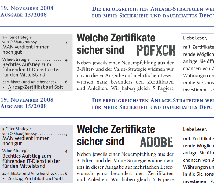
First image, PDFXChange greyscale antialiasing vs. Adobe subpixel antialiasing:
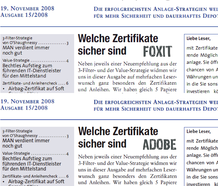
Second image, Foxit subpixel antialiasing vs. Adobe subpixel antialiasing:
Third image, PDFXChange greyscale antialiasing vs. Foxit subpixel antialiasing:

Again it is to be noted that subpixel rendering (both Foxit and Adobe) makes much difference even on the large black heading in the middle of the image -- which looks rather blurred when rendered by PDFXChange.
Generally still, nothing beats Adobe font rendering which looks almost as sharp on the eyes as magazine print (at least on a decent monitor with more than 100dpi).
Hope that helps and keep up the good work,
Cheers David.P
This is because the third of the three main (giant) players now does subpixel rendering as well -- though not yet as good as Adobe.
First image, PDFXChange greyscale antialiasing vs. Adobe subpixel antialiasing:

Second image, Foxit subpixel antialiasing vs. Adobe subpixel antialiasing:

Third image, PDFXChange greyscale antialiasing vs. Foxit subpixel antialiasing:

Again it is to be noted that subpixel rendering (both Foxit and Adobe) makes much difference even on the large black heading in the middle of the image -- which looks rather blurred when rendered by PDFXChange.
Generally still, nothing beats Adobe font rendering which looks almost as sharp on the eyes as magazine print (at least on a decent monitor with more than 100dpi).
Hope that helps and keep up the good work,
Cheers David.P
David.P
PDF-XChange Pro
PDF-XChange Pro
-
John - Tracker Supp

- Site Admin
- Posts: 5225
- Joined: Tue Jun 29, 2004 10:34 am
Re: FONT Rendering - Could Be Better
Hi David,
Thanks for your examples and info - always appreciated.
You will of course accept this can be a very subjective topic as it does depend on the quality of hardware being used (and the users natural eye sight too) if this is discernible for anyone but those most sensitive to the topic specifically - there are examples where are our current methodology will actually produce better output Than both Adobe and Foxit.
However - never complacent, I am pleased to advise we are progressing well with a 100% new rendering engine that we are confident will not only match the above - but in many cases actually surpass - we expect to release this in the summer with version 3 or perhaps just a little later after some testing period with the new release is possible.
Thanks for your patience.
If posting files to this forum - you must archive the files to a ZIP, RAR or 7z file or they will not be uploaded - thank you.
Best regards
Tracker Support
http://www.tracker-software.com
Best regards
Tracker Support
http://www.tracker-software.com
-
David.P

- User
- Posts: 1694
- Joined: Thu Feb 28, 2008 8:16 pm
Re: FONT Rendering - Could Be Better
John, thank you for taking your time to reply. More than glad to hear that you're working on a new rendering engine.
I still do hope sincerely though that the one way or the other, the new rendering engine will employ some kind of subpixel control. Because without doing so, there's no way really to get past the blurriness that is connected with grayscale (=full pixel) antialiasing.
Looking forward for the next version of PDFXChangeViewer,
best regards
and keep up the good work
David.P
David.P
PDF-XChange Pro
PDF-XChange Pro
-
John - Tracker Supp

- Site Admin
- Posts: 5225
- Joined: Tue Jun 29, 2004 10:34 am
Re: FONT Rendering - Could Be Better
Hi David,
Thanks for the kind words - always appreciated.
we will indeed be offering sub-pixel rendering and actually going a little beyond - I don't want to expand on that for now as we believe the option we have started progressing offers substantially superior potential to that being employed by both Adobe and Foxit, if we get this right (and I am confident at this point we will from the early results shown) - this could be a major step forward for us
If posting files to this forum - you must archive the files to a ZIP, RAR or 7z file or they will not be uploaded - thank you.
Best regards
Tracker Support
http://www.tracker-software.com
Best regards
Tracker Support
http://www.tracker-software.com
-
David.P

- User
- Posts: 1694
- Joined: Thu Feb 28, 2008 8:16 pm
Re: FONT Rendering - Could Be Better
Whooa John -- you guys at Tracker Software surely know how to keep us users amazed 
Best regards
David.P
Best regards
David.P
David.P
PDF-XChange Pro
PDF-XChange Pro
-
John - Tracker Supp

- Site Admin
- Posts: 5225
- Joined: Tue Jun 29, 2004 10:34 am
Re: FONT Rendering - Could Be Better
Fingers crossed David 
Cheers
Cheers
If posting files to this forum - you must archive the files to a ZIP, RAR or 7z file or they will not be uploaded - thank you.
Best regards
Tracker Support
http://www.tracker-software.com
Best regards
Tracker Support
http://www.tracker-software.com
-
David.P

- User
- Posts: 1694
- Joined: Thu Feb 28, 2008 8:16 pm
Re: FONT Rendering - Could Be Better
Another quick update, now that v3 is out:
First image (old), PDFXChange Viewer v2.x greyscale antialiasing vs. Adobe subpixel antialiasing:
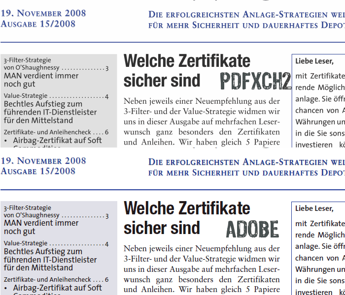
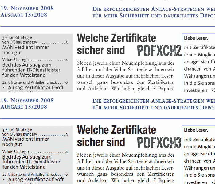
Second image (new), PDFXChange Viewer v2.x greyscale antialiasing vs. PDFXChange Editor v3.x subpixel antialiasing:
Third image (new), PDFXChange Editor v3.x subpixel antialiasing vs. Adobe subpixel antialiasing:
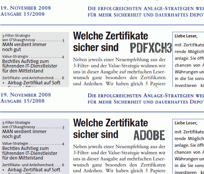
Very impressive improvement in v.3 me thinks
Cheers David.P
First image (old), PDFXChange Viewer v2.x greyscale antialiasing vs. Adobe subpixel antialiasing:

Second image (new), PDFXChange Viewer v2.x greyscale antialiasing vs. PDFXChange Editor v3.x subpixel antialiasing:

Third image (new), PDFXChange Editor v3.x subpixel antialiasing vs. Adobe subpixel antialiasing:

Very impressive improvement in v.3 me thinks
Cheers David.P
David.P
PDF-XChange Pro
PDF-XChange Pro
-
Stefan - PDF-XChange

- Site Admin
- Posts: 19930
- Joined: Mon Jan 12, 2009 8:07 am
Re: FONT Rendering - Could Be Better
Hi David,
And thanks for the kind words
Cheers,
Stefan
And thanks for the kind words
Cheers,
Stefan